The Importance of Colour Management in Creative Design
In the creative industries we output designs, illustrations, and photographs in a variety of media; often onscreen or in print. Where tone and colour are concerned, there can be a disparity between what we see on screen, in the design-edit stage of our workflow, and the proofing or final output of our work. Colour Management is the art and science of rendering tone and colour reliably from input to output.
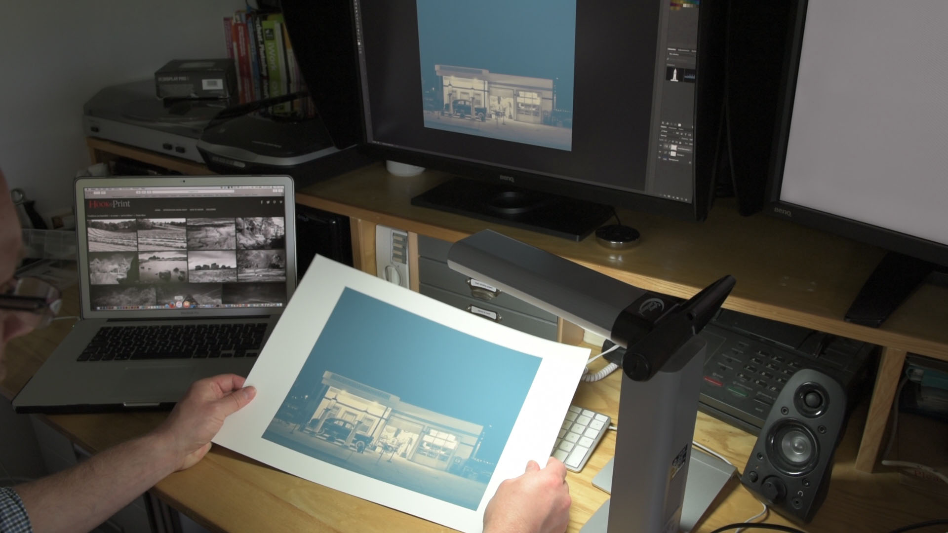
Figure 1 – Viewing A Print – a full spectrum light should be used to illuminate a print properly. All monitors should be calibrated, preferably at the hardware level.
Unexpected tone and colour rendition is at best frustrating, but often is time consuming and costly. I still remember sending my first full-colour brochure to press. I worried, had I done everything correctly? Would the client be happy with the print? I was full of anxiety because as a young freelance designer I could ill afford the cost of a print re-run should I have got something wrong. And let’s face it who would be overjoyed with being billed for a mistake. From the beginning of my career I have understood the importance of colour management, which may seem baffling and opaque, but is a discipline any graphic designer, photographer, or digital artist should understand. The underpinning theory can be outlined in about an hour. The practical skills can be covered in less than a day. In this article I will briefly explain the importance of a good monitor, and the limitations of colour reproduction. By understanding these two topics you will then know what can and cannot be achieved by colour managing your workflow, whatever discipline you may follow.
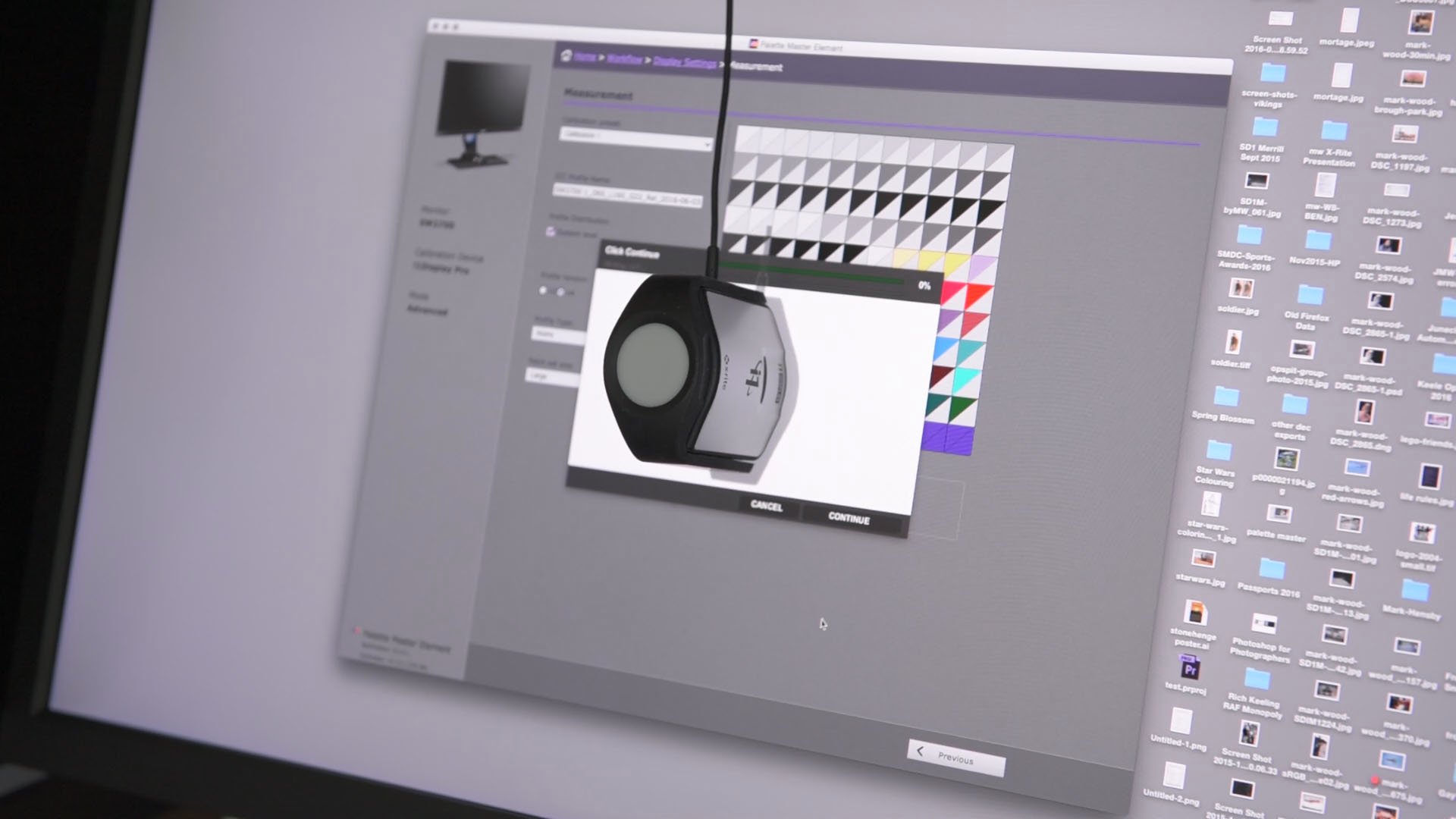
A good monitor is the one of two essential hardware items needed for successful colour management, the second is a calibrator to tune the monitor. For colour management to work, a monitor that can be hardware calibrated should be used. My preference is the professional range of BenQ monitors, which, like other pro-colour management displays, uses the calibration device to set the black and white points of the monitor before measuring a myriad the colour values. Rather than only making a software profile the calibrator tunes the tones and colours in the monitor’s hardware. In plain language the hardware looks after itself, you only need to choose your preferences and sit back and let the magic happen.
Figure 2 — Hardware Calibration. Proofing monitors like the BenQ SW2700PT can be tuned to display tone and colour accurately and easily.
A professional colour management monitor offers more than ease of set-up, once tuned-up it can be relied on to display tone and colour properly. Video-editing monitors can be set to match broadcast standards, in reprographics and photography printing standards can be emulated reliably. Monitors need to be chosen based on creative disciplines. The demands of video colour are not the same as print, so only having one generic monitor is not likely to lead to the most reliable output.
I’ve used the term ‘reliable’ several times to avoid saying accurate. Colour management is the art of compromise. At best colours in output will looks almost identical to the input colours. In class I explain how to best manage the colour compromises to give the illusion of accuracy.
The limitations of colour reproduction become apparent when a device used for output has less tone and colours than the input file. You would not expect a black and white photocopier to be able to reproduce colour. In the same way an office colour printer will not produce prints with the richness and colour depth of an inkjet printer designed for photographers. No degree of colour management can overcome the limitations of output devices. This is a key message of my colour management workshops; to know what is possible and what is not.
Figure 3. If an output device such as a monitor or printer can only achieve the red in box C no amount of profiling will fix the problem. The red in box B has a touch of blue in it; profiling may fix the colour cast to give the desired red found in box A.
In graphic design, inkjet printers may be used to make hard proofs of artwork destined for lithographic or short-run-digital printing. It is likely that the inkjet printer will have greater colour capability than either litho-print or the short-run-digital printer. In this case graphic designers need to know how to make their inkjet output mimic the colours of the final print-run.
Proofing is another important topic I cover. I know many novice graphic designers have suffered when they’ve shown clients proofs of artwork in colours more vibrant and rich than the end prints, leaving clients disappointed with the final work; with much soul-searching as to what went wrong. In print, Hard-proofing will overcome this problem. In addition soft-proofing, another workshop topic, helps with both print and onscreen output in managing expectations, and avoiding disappointments.
Figure 4. Soft-proofing emulates output conditions, and is similar to hard-proofing. However, hard-proofing requires a print to be made. With soft-proofing print conditions can be mimicked onscreen. Here the image of the left shows the ideal colour. The image on the right emulates the best tone and colour that can be achieved on a fine-art rag paper.
Colour management, whether for reprographics, digital art, or photography, is an essential skill to master. Even though it’s a technical subject it can be explained in clear concise language. Add to that some hands-on practice and the foundations for a happy colour consistent future are set.

 0345 363 1130
 info@xchangetraining.co.uk


