0345 363 1130
 info@xchangetraining.co.uk


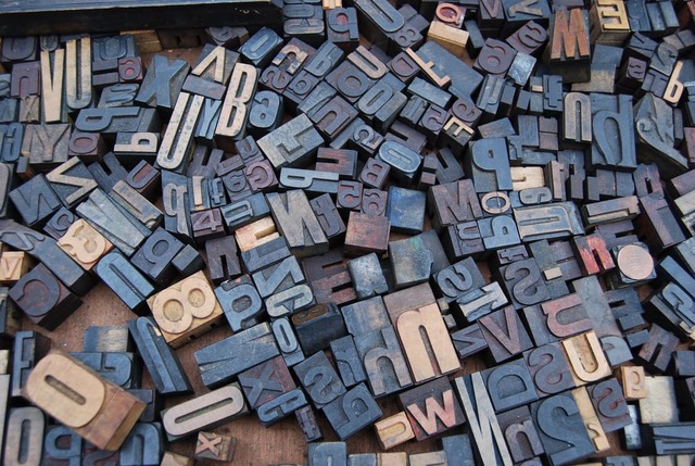
Typography Best Practices You Should Follow

Typography is the art, and technique of arranging a typeface or font to communicate a message. Aside from being used as a communicative tool, the typography you use in a design has an equal measure of influence as the words themselves. The verbal language may say one thing, but the visual language also conveys it’s own message too.
They say a photograph speaks a thousand words, and it seems that the style of typeface we use also holds a similar power.
Good typography practice is often down to creative intuition – essentially, you will know when you’ve created a design which works, and one which leaves little to be desired. Yet, there are some best practices that you can keep in mind.
Choosing a Font
There are a number of typeface resource libraries available which offer free and paid for options however choosing from such a large plethora of typefaces can make the decision as to which to use even harder. Plus, it’s likely they will have already been used by other brands and businesses, something which you may be keen to avoid.
If you want to create a truly unique design, then investing in a typeface designed specifically for your business or communications is something you may want to consider. A calligrapher will begin sketching out different styles, before these are transferred to a digital platform. They will also be able to guide you in which typeface pairings work best and provide you with a full range of characters and symbols for use.
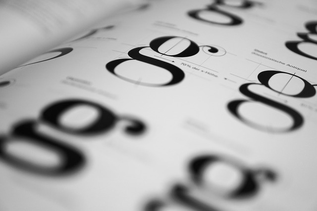
Understand Widths
Not all typefaces are created the same; some are thin, fat, wide or narrow, therefore not all fonts are going to work when used alongside one another. When putting different typefaces together, considering the size of the letters can help you to create the right pairings.
The height of a character is often referred to as ‘X height’, as it’s based on all characters when displayed as the ‘X’. Therefore, it’s always advisable to use typefaces which have a similar X height. This can ensure that your design looks balanced, and includes typefaces which create a harmonious message.
Leading
Leading lines can be used to aide composition in design, and help to draw the audience to the main subject or important area in the overall design. Usually, a leading path will start at the bottom of a frame, and guide the upwards and inwards, from the foreground of an image towards the main subject.
When put into the context of typography, it refers to the vertical space between each line of type. For text purposes, it is recommended that the leading should be between 1.25 to 1.5 times greater than the font size.
Kerning
Kerning is the process of changing the spacing between characters so that the result is visually pleasing. Every typeface you use will require a different kerning process – so, if you’re using a number of different fonts then you will want to start kerning early on.
Kerning is a more complex task than you may think as it can greatly influence our perception of a word. For example, some letters create a more complementary pairing than others. And where certain words cannot be avoided, it’s the job of a typographer to make the typeface used work in a positive manner, rather than one which clashes. The letters ‘AV’ work much better together and complement one another, rather than ‘LA’ where the characters don’t lean in to one another.
Hierarchy
Some parts of the message you want to share will be more important than the others, therefore it’s important that you give your typography a hierarchal structure. As a typographer, your role is to guide the audience into understanding what key points they should be taking away once they have finished reading your piece of content.
Traditionally, headings are large, sub-headings smaller and body time smaller than both. As a rule of thumb, you may want to multiply your body font size by 2 to get your heading font size. The colour, spacing and weight of a typeface can all influence the hierarchy of your message, so it can be worth having a play around with this too.
Background
Once you implemented your typography best practices, you will also want to consider how the background you are placing your typography on influences the overall impact of your work. While black text on a white background is seen as the norm, you can create striking results if you shy away from tradition.
A word of caution; if you are playing around with darker backgrounds then make sure that your text is bold and clear enough to be easily read. Far too often light typefaces, in colours which create little contrast with their background, are used in communications and end up unreadable.