0345 363 1130
 info@xchangetraining.co.uk


What is Kerning ?
Kerning is applied to letters in a headline to create an evenly spaced, aesthetically pleasing effect. In the example below the first line has been kerned using the font manufacturer’s kerning settings. For the second line the kerning has been adjusted by eye using InDesign’s kerning feature.
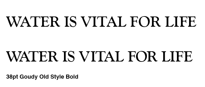 Although there are pairs of letters that are more likely to need kerning, such as Wa, WA, AT aT etc, you can see that many of the pairs of letters in the example above have been adjusted, if only by a tiny amount.
Kerning successfully is a subjective matter and whether you make the letters tighter or looser is dependent on the typographical style you want. Once you have kerned your letters you can then change the spacing equally between all the letters using tracking or letter spacing.
Unfortunately there aren’t standard kerning values that will apply to all fonts. So if you have adjusted your kerning and then you change your font, you will have to re-kern it. Each font contains within the software what are known as ‘kerning pairs’, which are kerning values the font manufacturer has applied to particular pairs of letters. However, despite these kerning pairs, you are unlikely to come across a font that doesn’t need at least some kerning adjustment.
How to kern type in InDesign
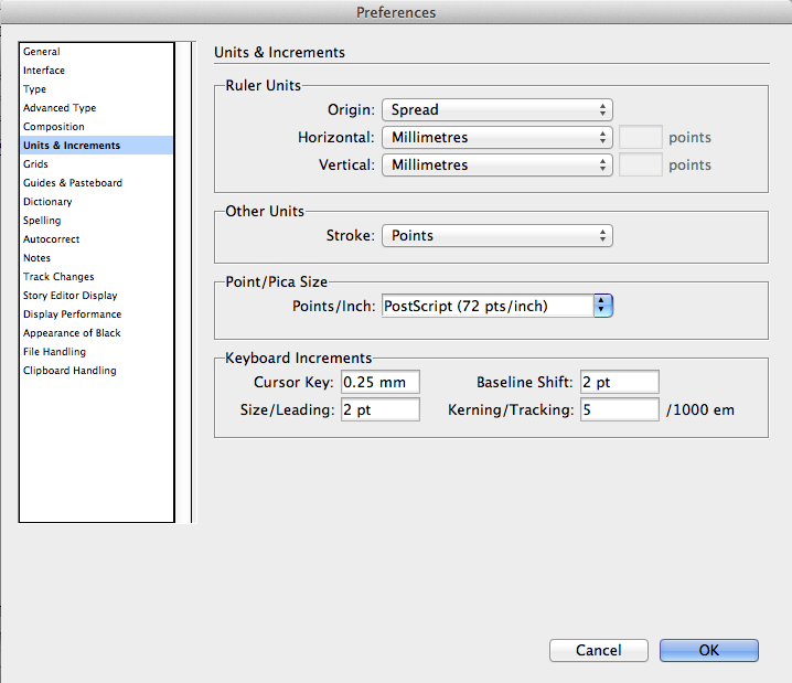
To kern type in InDesign you place the cursor so it is flashing between two letters and adjust the kerning setting in the Control panel at the top of the screen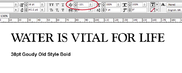 You can also use the keyboard shortcut, which is Alt + Right or Left arrow on the keyboard. The problem with using the keyboard shortcut is that the default setting for the increment the kerning increases or decreases by each time you press the arrow key is 20 units and is far too high. You can easily change it though by going to Preferences > Units and Increments (on a Mac the Preferences are in the InDesign menu and on a PC they are in the Edit menu). Make sure you have all documents closed before you change the preference and it will hold good for any new documents you create. A suitable value to change it to is 5 units.
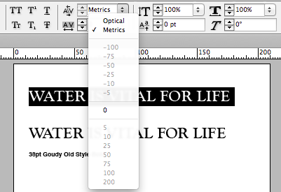
 You can also change the kerning settings used for type more generally in InDesign. If you have 2 or more letters selected you have three options in the kerning drop-down menu on the Control panel: 0, Metrics or Optical. You may well find that Optical gives you a better result. It uses kerning settings created by Adobe rather than by the font manufacturer. If you choose 0 no kerning will be applied to any of the letters.
 It is useful to both practice kerning and look at headlines kerned by others. Then you’ll be on the way to creating typographically beautiful layouts.
If you need further information to improve your design skills including Kerning control visit either our Adobe InDesign courses page or QuarkXPress training page or send us an email with your query.