 0345 363 1130
 info@xchangetraining.co.uk


Effective Page Layout Design with Grids
Page Layout: Why use ten columns when three will do?
What is a grid?
The grid defines the structure on a page by laying out the spacing for margins and columns. The grid can also define the ‘baseline grid’, which defines where the baselines of type sit within the page. This article focuses on how you can play with the columns on the page to create more flexibility in your layout.
The margins and columns create a container for your illustrative elements and type. They can provide symmetry and proportionality but the challenge is to avoid the grid becoming a holder for a boringly repetitive layout.
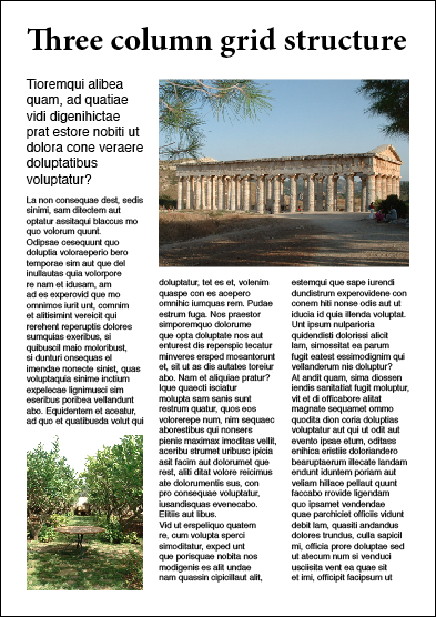
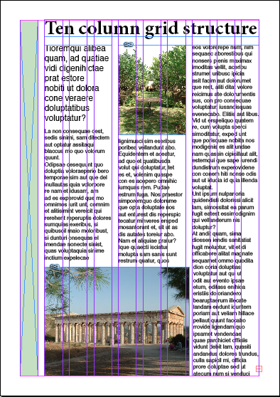
Simple grid structure
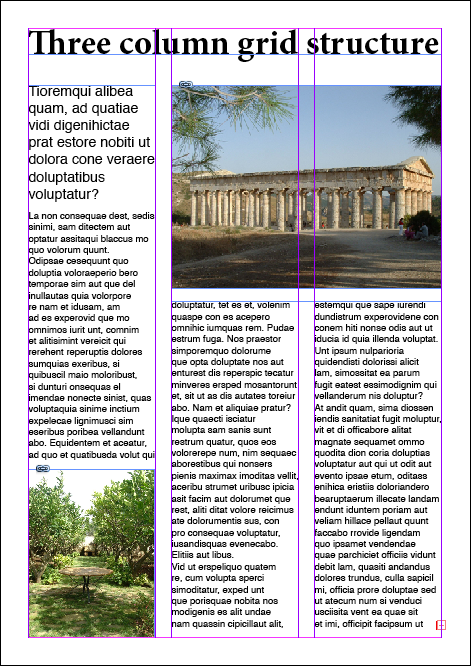
Using a simple grid structure of two, three or four columns creates a quick and easy way to position columns of text. However these simple grids have their limitations because it is hard to vary where the elements sit as shown below:
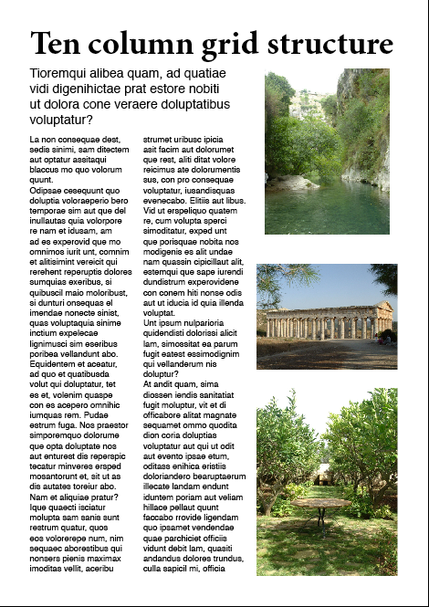
So why use ten columns?
Initially you might imagine a ten column grid to be a ridiculous idea. Unless the grid was for a broadsheet newspaper, using a single column for text would be far too narrow. However, for a smaller size of paper you can combine columns to create wider columns of text. So you could turn the grid into a three column layout with three columns of text, each spanning three columns of the grid, leaving a single column. You can then change where the extra column sits: it could be on the outside of one page, or after the first or second column on another. The main thing you need to make sure is that the gutter you define is wide enough to create sufficient space between the columns.
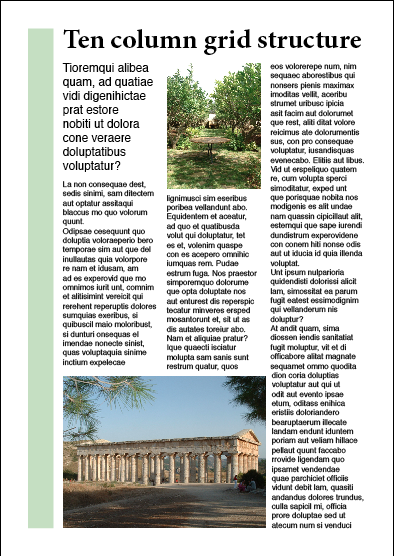
You could also use ten columns to create three columns on the page that have different widths. So you could have two columns that each span the width of three of the grid columns and a single column that spans four of the grid columns. This would still challenge the symmetry of having three columns and could be used in combination with pages that leave a single column without text.

You can use the variety that this kind of layout offers to use different combinations for the different sections of your document. If you were designing a newsletter, you could use a narrower combination of five columns that each span two of the grid columns for the news section and then two columns that span four of the grid columns for pages with longer articles.
Go wild: use even more columns
You can use the principles I’ve just described and create a grid with even more columns: eleven, twelve or even thirteen. You might be surprised to find that in defining something as constrained as a grid you can still express your creativity – have fun!
If you need further information to improve your design skills including effective use of grids in design visit either our Adobe InDesign courses page or QuarkXPress training page or send us an email with your query.