0345 363 1130
 info@xchangetraining.co.uk


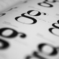
Typeface Style Options for Design
Understanding something about the different styles of typeface should help when designing printed materials. Choosing the right typeface makes a big difference to the mood and feel of a piece of design and hopefully this guide will help you to appreciate something of the chronological development of type styles and the different type designs you might choose from.
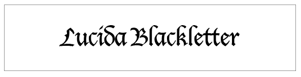
The first typefaces appeared with the first printing presses. They were heavy and followed a style of calligraphy popular in Germany where the first European printing press that used moveable type was developed. These typefaces are known today as Blackletter.
Old Style or Humanist Typefaces
Between the late 15th and mid 18th centuries serif ‘old style’ or ‘humanist’ faces were designed. These were the first serif typefaces and they are characterized by minimal contrast between stroke weight in the characters, angled serifs and backeted serifs. Examples include: Jenson, Bembo and Garamond

Transitional Serifs
As printing developed, making it possible to print much finer character strokes, Baskerville, an English printer and typographer developed a new style of type with more of a vertical emphasis and sharper serifs. Examples include: Baskerville and Perpetua

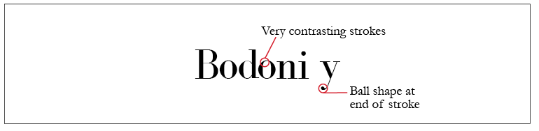
Neoclassical/Didone or Modern Serifs
These typefaces were developed in the late 19th and early 20th centuries. They feature a completely vertical axis, very contrasting strokes and often ball shapes at the end of a stroke. Examples include Bodoni, ITC Fenice and Walbaum
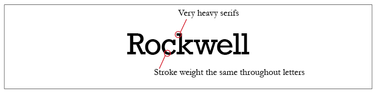
Slab serifs
Sometimes described as Egyptian these typefaces were developed in the 19th century for advertising headlines. They have very heavy serifs and the stroke weights are the same throughout the entire letter. They look like sans serif typefaces with heavy serifs added. Examples include: Rockwell
Sans Serif Typefaces
Sans serif typefaces were developed for printing in the 20th century, particularly in Germany as an alternative to the Blackletter typeface styles. There are a number of different styles of serif:
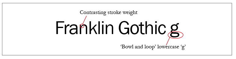
Grotesque Sans Serif
These typefaces have a contrasting stroke weight and have taken features of the serif faces such as the ‘bowl and loop’ lowercase ‘g’. Examples include: Helvetica, News Gothic, Univers and Franklin Gothic.
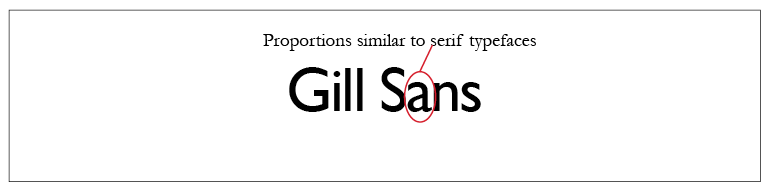
Humanist Sans Serif
The letters in this style of sans serif typefaces mimic the proportions of many serif faces. Many typographic experts would say these are the most legible of the sans serif typefaces. Examples include: Gills Sans and Frutiger.
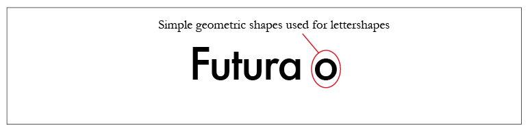
Geometric Sans Serif
These typefaces use simple geometric shapes to form the letter shapes. They have little or no variation in stroke weight and are considered to be less readable than some other sans serif fonts. Examples include: Futura, Bauhaus, Avenir
Script Typefaces
These are typefaces that mimic different writing styles. Examples include: Brush script and Lucida Handwriting.

There are many beautiful typefaces that have been designed over the years so it is worth taking some time to reacquaint yourself with some of the classics, and remember to use the differences between them to create contrast and variation when designing your type.
If you need further information to improve your design skills including effective use of Typefaces in design visit either our Adobe InDesign courses page or QuarkXPress training page or send us an email with your query.